Small-Business Website Accessibility Checklist: 12 Practical Checks
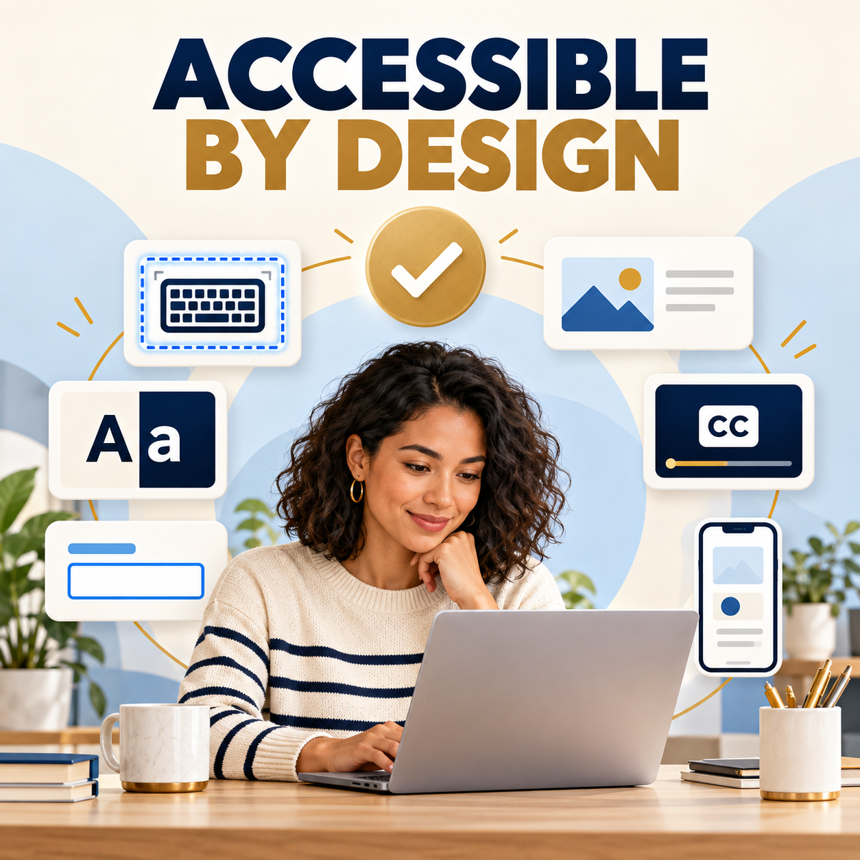
A small-business website can look polished and still be difficult—or impossible—for some people to use. A visitor may be unable to reach the navigation without a mouse, understand a form error, read low-contrast text, pause moving content, or determine what an image or button does.
Website accessibility is the practice of making digital content and functions usable by people with disabilities. The World Wide Web Consortium describes accessibility broadly: people should be able to perceive, understand, navigate, interact with, and contribute to the web. That includes people with visual, auditory, physical, speech, cognitive, and neurological disabilities.
This small-business website accessibility checklist focuses on practical checks an owner or team can perform before a redesign, after an update, and during routine maintenance. It is not a certification or legal opinion. Accessibility requirements vary by organization and situation, and a short checklist cannot replace a qualified evaluation. It can, however, reveal common barriers and give the business a responsible place to begin.
Start with the customer tasks that matter most
Accessibility work is easier to prioritize when it is connected to real customer tasks. List the actions people must be able to complete: understand the main service, open the menu, call the business, request a quote, schedule an appointment, purchase a product, read directions, or submit a form.
Test those paths first. A decorative icon with an imperfect label may deserve attention, but a keyboard trap in the appointment form can block the entire transaction. OHS Publishing’s Kansas City web design approach starts with what the business needs visitors to understand and do. Accessibility belongs inside that same planning process rather than at the end as a separate cosmetic review.
The Web Content Accessibility Guidelines (WCAG) provide an international standard for accessible web content. They organize accessibility around four principles: content and controls should be perceivable, operable, understandable, and robust. Owners do not need to memorize every success criterion before they start checking their most important pages, but the standard gives developers and evaluators a common reference.
1. Use the website with only a keyboard
Put the mouse aside and press the Tab key from the top of the page. You should be able to move through the navigation, links, buttons, form fields, menus, and other interactive controls in a logical order. Shift+Tab should move backward. Enter or Space should activate the appropriate control, and Escape should close common overlays or menus when that behavior is expected.
Watch for three problems: the focus indicator disappears, the order jumps unpredictably, or focus becomes trapped inside a component. A visible focus outline is not a design flaw. It tells keyboard users where they are. If a menu opens only when a mouse hovers, or a popup cannot be closed without clicking a tiny icon, the path needs more work.
Repeat the test on the homepage, one service page, the contact page, and any booking or checkout flow. Keyboard testing is especially important after installing a new theme, page-builder element, menu, slider, chat widget, or form plugin.
2. Check the page structure and heading order
Headings should describe the organization of the page, not simply make text larger. Use one clear H1 for the main topic, then H2 headings for major sections and H3 headings for subsections. Do not choose a heading level because its default font size looks attractive.
A logical outline helps everyone scan the page and allows assistive-technology users to move between sections efficiently. W3C’s heading guidance explains that headings should reflect the organization of the content. Review templates as well as individual pages because a theme can introduce repeated or out-of-order headings in the header, sidebar, or footer.
Page titles also matter. Each important page should have a descriptive browser title that distinguishes it from the rest of the site. “Services” is vague when the business has several service pages; “Residential Plumbing Services in Kansas City” gives people more context.
3. Make links and buttons understandable
A visitor should be able to understand a link or button without guessing from its color, icon, or position. Use labels such as “Request a Website Quote,” “View Maintenance Plans,” or “Download the Service Guide.” Repeated labels such as “Click Here” and “Learn More” provide little information when someone navigates a list of links out of context.
Buttons should be real interactive controls, not styled text or an image that only looks clickable. Phone numbers should be usable as phone links where appropriate, and linked email addresses should identify their purpose. If a link opens a document, a new window, or a different type of experience, tell the visitor when that information would prevent surprise.
4. Review color contrast and non-color cues
Light gray text on white, gold text on a pale background, or text placed over a busy photograph can be difficult to read. Check body copy, headings, navigation, form labels, placeholders, buttons, and error messages. Test normal, hover, active, disabled, and focus states—not only the default design.
Do not use color as the only way to communicate meaning. A required field can use a symbol and text in addition to color. An error should identify the field and explain what needs to change instead of adding only a red border. Links inside paragraphs should remain recognizable when someone cannot distinguish the link color from the surrounding text.
Contrast tools are useful, but they need the real foreground and background values. A screenshot, gradient, transparent overlay, or photograph may require testing several points. When an older design has widespread contrast and readability problems, a focused website redesign may be more dependable than layering small fixes over inconsistent templates.
5. Give meaningful images useful text alternatives
Alt text should communicate the purpose or meaningful content of an image to someone who cannot see it. The best wording depends on the context. A photo that proves a completed roofing project needs a different description from the same photo used only as a decorative background.
Keep descriptions concise and specific. Avoid stuffing service and city phrases into every image. W3C’s image accessibility guidance notes that generic words such as “image” or “picture” are usually unnecessary because screen readers already announce the element as an image.
Decorative images generally need an empty text alternative so assistive technology can skip them. Functional images—such as an icon used as the only content of a button—need a text alternative that explains the action. Charts, maps, and diagrams may require a nearby explanation or a longer text equivalent. The same principle applies to portfolio sites: the photography portfolio website guide explains how descriptive filenames, relevant surrounding copy, and accurate alt text support a useful gallery without turning image fields into keyword lists.
6. Test forms, labels, instructions, and errors
Every form control needs a clear programmatic label. Placeholder text inside a field is not a complete substitute because it may disappear when the visitor starts typing, provide weak contrast, or fail to communicate the relationship reliably. Group related options, explain required formats before submission, and identify required fields consistently.
Submit the form with missing or incorrect information. The error message should be easy to find, identify the affected field, explain the problem in plain language, and help the visitor correct it. W3C’s tutorials on labeling form controls and form notifications provide practical examples.
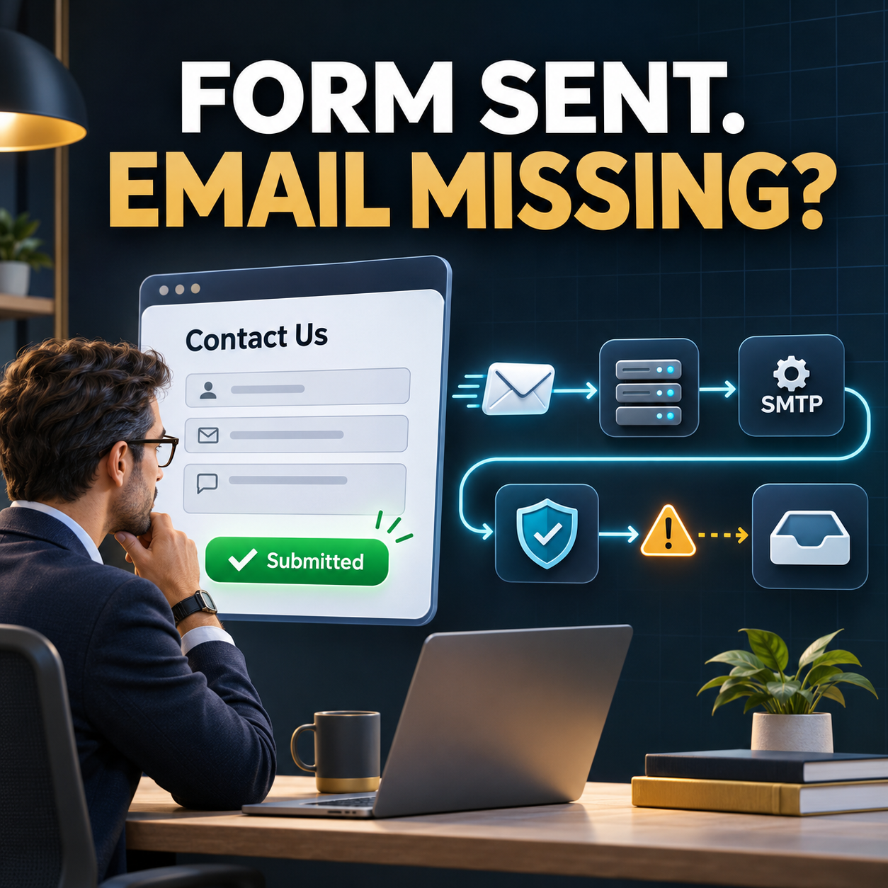
After a successful submission, confirm that the result is announced and visibly clear. The OHS guide to what should happen after a website contact form is submitted covers confirmation, routing, follow-up, tracking, and routine testing. Accessibility should be part of that full workflow, not limited to whether the Submit button can be clicked.
7. Zoom, resize, and test real mobile screens
Increase browser zoom and check whether text remains readable without overlapping, disappearing, or forcing unnecessary horizontal scrolling. Resize the browser window and rotate a phone between portrait and landscape. Menus, forms, tables, cookie notices, and floating buttons often fail before the main content does.
Do not disable zoom on mobile. People with low vision may need to enlarge content even when the page is technically responsive. Tap targets should have enough size and spacing to reduce accidental activation. Important controls should not sit underneath a sticky header, chat bubble, or mobile browser interface.
8. Provide captions, transcripts, and media controls
Videos with spoken information need accurate captions. Audio-only content should have a transcript or equivalent information. Captions should identify relevant speakers and important sounds when that context affects understanding. Automatically generated captions are a starting point, not a finished result; names, local terms, technical language, and punctuation often need correction.
Give visitors a way to pause, stop, or control media. Avoid autoplay with sound. If a background video contains no information, treat it as decorative and make sure it does not interfere with text, controls, performance, or motion-sensitive users.
9. Reduce unexpected motion and time pressure
Carousels, animated counters, parallax effects, flashing promotions, and automatic page changes can create barriers. Motion may distract from reading, make controls difficult to reach, or trigger physical symptoms for some visitors.
Use animation only when it supports the task. Provide controls for moving content, respect reduced-motion preferences when the implementation supports them, and avoid essential information that disappears before a person can finish reading. If a form or checkout uses a time limit, explain it and provide a reasonable way to extend the session when possible.
10. Review PDFs, menus, maps, and third-party widgets
The website may be accessible while a key document or embedded service is not. Restaurant menus, intake forms, price lists, event flyers, maps, scheduling tools, payment systems, chat widgets, and social feeds are part of the visitor’s experience.
Do not make an image-only PDF the sole source of important information. Provide an accessible web version when practical, and review document headings, reading order, link text, table structure, and form fields. For third-party tools, test the actual task with a keyboard and common assistive technologies. Ask the vendor for current accessibility information, but do not treat a badge or statement as proof that the implementation on your site works.
11. Write content that is clear and predictable
Plain language helps people with different reading abilities, cognitive disabilities, language backgrounds, and levels of subject knowledge. Use short descriptive headings, explain unfamiliar terms, keep instructions near the action they describe, and maintain consistent names for navigation items and services.
A predictable layout reduces effort. The same action should not be called “Book,” “Reserve,” “Get Started,” and “Submit Request” on four similar pages unless the actions are genuinely different. Important phone numbers, service areas, hours, and eligibility information should be written as text rather than embedded only inside graphics.
12. Combine automated scans with manual testing
Automated tools can quickly identify some missing labels, empty links, contrast failures, and code problems. They cannot reliably decide whether alt text is meaningful, the keyboard order makes sense, instructions are understandable, or a workflow is usable. A clean automated score is not the same as an accessible website.
Use both methods. Scan representative pages, then manually complete the primary tasks with a keyboard, zoom, and a screen reader when qualified testing is available. Include the homepage, each major template, contact and quote forms, account areas, checkout, and any page with unusual interactive features.
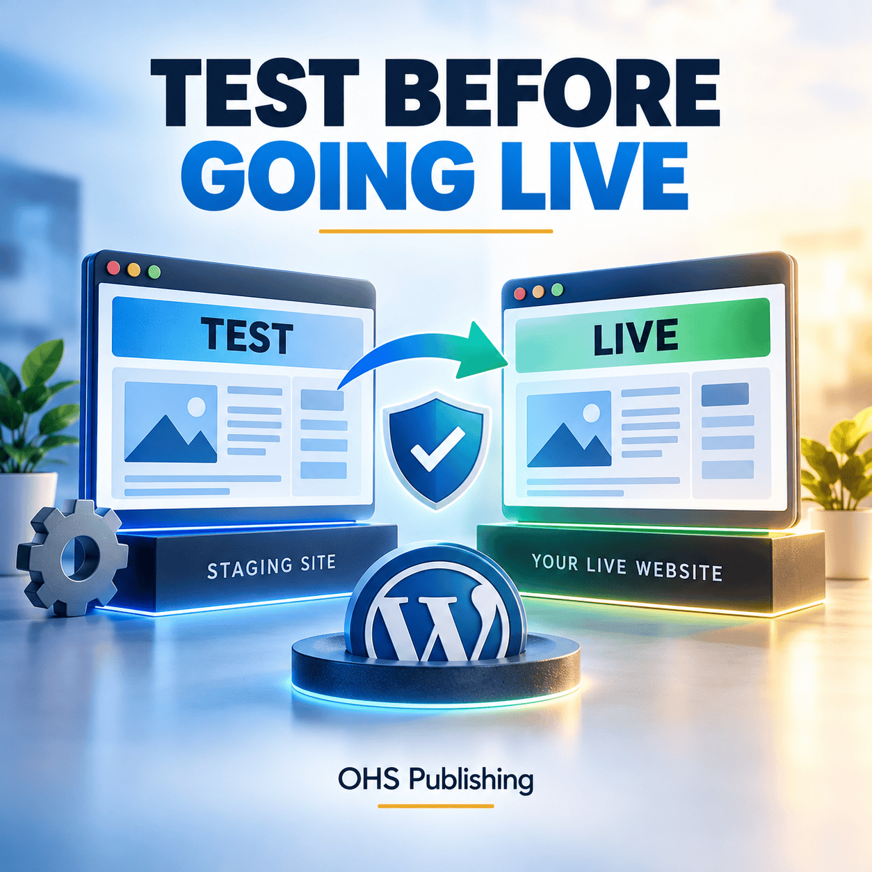
For WordPress, test changes on a safe copy before modifying a live business workflow. The guide to using a WordPress staging site explains what to check before deployment. Ongoing reviews can also fit inside a dependable website maintenance plan, especially after theme, plugin, form, or content changes.
A 20-minute accessibility walkthrough for business owners
If you need a manageable first pass, choose one high-traffic service page and one contact or quote form. Then:
- Read the page title and headings. Confirm that the outline makes sense.
- Tab through every interactive element without touching the mouse.
- Check that focus is visible and follows a logical order.
- Zoom the page and inspect it on a phone.
- Review text and button contrast in every state.
- Turn off images mentally: decide what each meaningful image needs to communicate.
- Submit the form incorrectly, then correctly, and review both responses.
- Open any document, scheduler, map, chat, or payment tool used in the path.
Record the page, barrier, affected task, severity, and proposed owner. Fix issues that completely block contact, purchase, scheduling, navigation, or access to essential information first. Then address repeated template problems because one correction may improve many pages.
Make accessibility part of normal website work
Accessibility is not a one-time plugin setting. New posts introduce images and headings. Staff members add PDFs. A theme update changes menus. A marketing tool adds a popup. A form update changes validation. Without a repeatable process, barriers return.
Create a short publishing checklist for everyone who edits the site. Require useful headings, descriptive links, appropriate alt text, caption review, and a quick keyboard and mobile check. Keep an inventory of third-party tools and assign someone to retest critical paths after changes.
The U.S. Department of Justice’s guidance on web accessibility and the ADA explains why access to online goods and services matters and identifies common barriers such as poor contrast and mouse-only navigation. Because legal obligations depend on the organization and facts, consult qualified counsel for legal advice. For the website itself, treat accessibility as part of quality, maintenance, and customer service.
When a small fix is enough—and when to plan a redesign
A missing label or isolated contrast problem may be a straightforward correction. A site with inaccessible navigation, repeated heading problems, outdated templates, image-only content, broken mobile layouts, and several conflicting plugins may need a more structured rebuild.
Before choosing the scope, identify whether the barrier comes from one page, a reusable template, the theme, a plugin, or a third-party service. Fixing the source is usually safer than patching every page separately. OHS Publishing’s WordPress web design service and redesign process can help organize content, templates, forms, and ongoing ownership around real business tasks.
If you are not sure where the website is losing clarity or creating friction, start with the Free Website Growth Score. For a redesign, accessibility improvement, or maintenance conversation, use the request form below.
Frequently asked questions
What is website accessibility?
Website accessibility means designing and maintaining digital content and functions so people with disabilities can perceive, understand, navigate, and interact with them. It includes the content, code, navigation, forms, media, documents, and third-party tools that make up the user experience.
Can an accessibility plugin make a website fully accessible?
No single plugin can evaluate or repair every accessibility issue. Automated tools can help identify some technical problems, but meaningful alt text, logical keyboard order, understandable instructions, usable forms, third-party tools, and complete customer workflows also require manual review and appropriate development work.
How often should a small business test website accessibility?
Test critical pages before launch, after major design or plugin changes, and on a recurring maintenance schedule. Content editors should also check headings, links, images, documents, and forms whenever they publish or substantially revise a page.
What should a business fix first?
Start with barriers that prevent people from completing essential tasks such as navigating the site, understanding the main service, contacting the business, scheduling, purchasing, or submitting a form. Next, repair repeated template problems and then address lower-impact page-specific issues.