Website Navigation Audit: How to Find What Customers Can’t Find
A visitor lands on your website with a simple question: Do you provide the service I need, in my area, at a price or process that makes sense? If the answer is buried under vague menu labels, deep dropdowns, or pages that do not link to one another, the visitor may leave even when your business is a perfect fit.
That is why website navigation is more than a row of links at the top of a page. It is the system that helps customers understand what you offer, find the right details, and take the next step. It also helps search engines discover important pages and understand how they relate. A navigation audit checks that system from the customer’s point of view instead of assuming the menu works because it looks tidy.
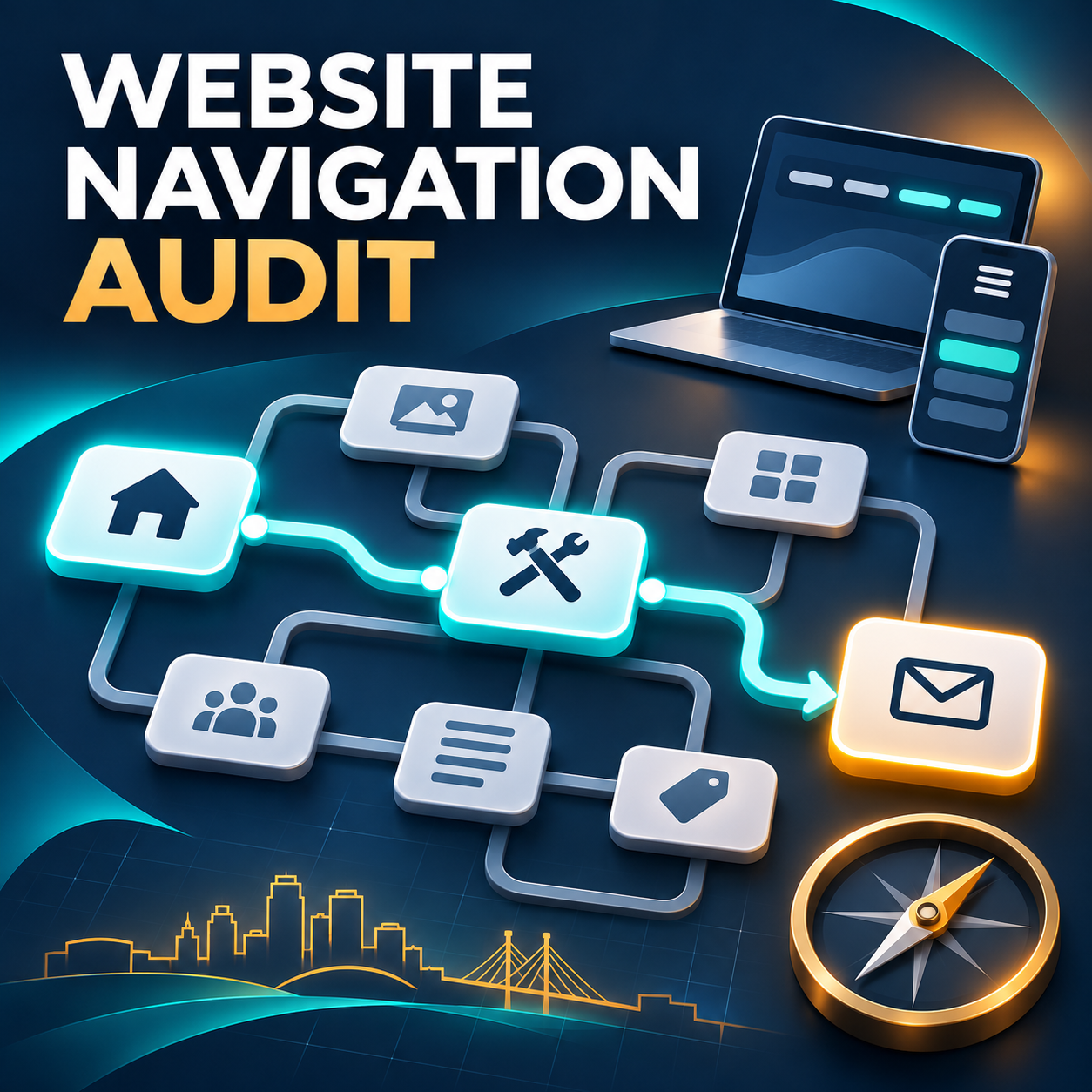
This guide explains how to run a practical website navigation audit without redesigning the whole site first. You will inventory the pages that matter, test common customer tasks, review the header, footer, mobile menu, page labels, internal links, and calls to action, and turn what you find into a prioritized repair list. If the audit reveals deeper structural or technical problems, OHS Publishing’s Kansas City website redesign service can help you plan the right scope.
What a website navigation audit should answer
A useful audit is not a debate about whether a hamburger icon looks modern. It answers practical questions about how people move through the site:
- Can a first-time visitor tell what the business does from the main navigation?
- Can someone reach every important service, location, or product category through normal links?
- Do labels use words customers understand, or internal terms that only the company uses?
- Does the mobile menu offer the same useful paths as the desktop menu?
- Can visitors tell where they are and what to do next?
- Do important pages link to related pages in a way that helps the customer continue?
- Are contact, quote, booking, or purchase actions easy to reach without becoming distracting?
These questions connect usability and search visibility. Google explains that links help it discover pages and understand relevance, and that important pages should receive links from other pages on the site. Its guidance also recommends standard crawlable links with descriptive anchor text rather than vague phrases or script-only controls. See Google’s link best practices for the technical details.
Start with customer tasks, not the current menu
Before opening the website, write down five to eight tasks a real visitor might need to complete. This keeps the audit focused on outcomes instead of preserving a menu simply because it has been there for years.
Examples of useful customer tasks
- Find the service that solves a specific problem.
- Confirm that the company serves a particular city or county.
- Compare two services, plans, or packages.
- See examples of work or learn how the process works.
- Check hours, contact information, financing, insurance, or pricing guidance.
- Request a quote, book an appointment, call, or visit a location.
Use tasks that reflect your business. A roofing company visitor may need storm-repair information and a service-area check. A dental practice visitor may look for a provider, insurance details, and a new-patient appointment. A professional-services prospect may need to understand the difference between two closely related services before requesting a consultation.
Give each task to someone who is not deeply familiar with the website. Ask that person to start on the homepage and say what they expect each label to mean. Record the path taken, wrong turns, and moments of hesitation. If no outside tester is available, use an incognito browser window and approach the site as if you have never seen it. The test is less objective, but it is still better than reviewing only the menu’s appearance.
Create a simple page inventory
A menu audit will miss problems if you do not know which pages exist. Export the website’s page list or use the XML sitemap as a starting point, then place the important URLs in a spreadsheet. For a small site, a list with four columns is enough:
- Page: the page title and URL.
- Purpose: the customer question or task it supports.
- Primary path: the menu, page, or section that should lead to it.
- Action: keep, improve, combine, redirect, or remove after review.
Mark pages that have no clear purpose, repeat another page, or cannot be reached through ordinary navigation. A sitemap can help search engines discover URLs, but it is not a substitute for a usable structure. Google notes that when pages are properly linked, it can usually discover most of a site through navigation and links. That is one reason an “orphan” page should be treated as a structural warning, not merely a sitemap issue.
Pay special attention to service, industry, and location pages. They often grow over time without a clear parent-child relationship. OHS Publishing’s guide to linking service and location pages for local SEO explains how to connect those pages without filling every paragraph with repetitive city names.
Audit the header navigation
The header should give a visitor a reliable overview of the site. It does not need to link to every page. It should reveal the main categories and offer a predictable route to deeper information.
Use labels that predict the destination
Labels such as “Services,” “Locations,” “About,” and “Contact” may sound ordinary, but clarity is valuable. A creative label is only helpful when a new visitor can predict what appears after clicking. Replace internal department names, abbreviations, and slogans when customers are unlikely to recognize them.
Read the menu labels without looking at the page. Could a prospective customer tell what the business offers? Then compare each label with the destination page’s heading. The promise made by the link and the page reached should feel consistent.
Keep the first level focused
If every service, city, resource, and company detail appears at the first level, the menu stops helping people choose. Group closely related pages under a clear parent. Put the highest-value or most common destinations where they are easy to find, and use landing pages to introduce larger groups of services or locations.
Do not hide important pages only because the site has many of them. The goal is a useful hierarchy: a visitor chooses a meaningful category, sees an understandable set of options, and reaches the needed page without guessing.
Check dropdown behavior
Open every dropdown with a mouse, keyboard, and touchscreen. Confirm that it stays open long enough to use, does not disappear when the pointer crosses a small gap, and does not place critical links off the screen. If the parent label is also a link, make sure visitors can tell that it opens a landing page instead of only controlling the dropdown.
Test the mobile menu as a separate experience
A responsive site can still have a weak mobile navigation experience. Test on an actual phone when possible, not only by narrowing a desktop browser.
- Can the menu be opened and closed without covering essential controls?
- Are expandable sections clearly identified?
- Can every visible item be tapped without hitting the item beside it?
- Does the menu scroll when the list is longer than the screen?
- Are the same important destinations available on mobile and desktop?
- Can a visitor reach the primary contact action without losing access to the rest of the site?
Mobile deserves this separate pass because Google indexes the mobile version of pages and advises sites to provide the same useful link set on mobile and desktop. More importantly, many local customers are trying to call, check a service area, or request help while using one hand and a small screen.
Mobile navigation also overlaps with accessibility. Visible keyboard focus, meaningful link text, and predictable repeated navigation help more people use the site. The W3C’s WCAG guidance on consistent navigation calls for repeated navigation to occur in a consistent relative order, while its link-purpose guidance emphasizes understandable link text or context. OHS Publishing’s small-business website accessibility checklist offers a broader practical review.
Review the footer, breadcrumbs, and site search
The header is not the only navigation system. The footer can provide dependable access to contact information, major services, service areas, policies, and other pages that do not belong in the primary menu. Remove links to outdated offers, duplicate destinations, and empty social profiles.
Breadcrumbs can help visitors understand their position on a larger site, especially when services, industries, locations, or product categories have several levels. A breadcrumb should reflect a logical route rather than a chain of unrelated labels.
Site search is useful for content-heavy websites, but it should not be the only way to find an important page. Test common customer terms, misspellings, service names, and location names. Review zero-result searches if your analytics or search tool records them. A repeated search term may reveal a missing label, missing page, or menu category that customers cannot interpret.
Audit contextual links inside the pages
Navigation continues after someone leaves the menu. A service page should guide the visitor to related services, useful locations, relevant examples, pricing or process details, and the right next action. A blog post should connect useful education to the service page that can solve the reader’s problem.
Look for dead ends
Open each high-value page and ask what a visitor is likely to need next. A page becomes a dead end when it explains one topic but offers no path to a related decision or action. Add links where they genuinely continue the visitor’s task. Do not add a block of keyword-heavy links simply to increase link counts.
Write descriptive anchor text
“Learn more” and “click here” provide little information when read on their own. Use concise text that describes the destination, such as “website redesign services,” “service-area planning guide,” or “request a web design quote.” This helps people scan, supports assistive technology users, and gives search engines useful context.
Check the destination, not just the link
A working link can still be wrong. Confirm that each link reaches the intended page, does not pass through an unnecessary redirect, and matches the surrounding promise. Fix broken links, but also fix links that send visitors to a broad homepage when a specific service or contact page would answer the question better.
Check calls to action without turning the site into a billboard
Calls to action are part of navigation because they help a visitor move from information to action. Identify the primary action for each page: call, request a quote, book, buy, visit, or read the next guide. Keep the wording and destination consistent.
More buttons do not automatically create a clearer path. If five actions have equal visual weight, the visitor still has to decide what matters. Give the primary action priority and use secondary links only when they support a different, legitimate stage of the decision.
If the website receives visits but produces few inquiries, navigation may be one piece of a larger conversion problem. Use the guide to what to fix when website traffic does not become leads to review the offer, trust, forms, and follow-up as well.
Turn findings into a prioritized repair list
Do not treat every issue as equally urgent. Sort findings into three levels:
- Critical path problems: important services cannot be found, mobile navigation fails, contact actions lead to the wrong place, or key pages are broken or orphaned.
- Clarity problems: labels are vague, categories overlap, dropdowns are crowded, or pages do not provide a logical next step.
- Refinements: footer cleanup, minor label improvements, breadcrumb adjustments, and secondary-link opportunities.
Fix critical paths first, then retest the original customer tasks. A successful repair should shorten the path, reduce hesitation, or make the destination easier to predict. Do not judge improvement only by whether the new menu looks cleaner.
Some sites need only a focused navigation cleanup. Others reveal a deeper mismatch between services, content, page templates, and technology. The guide to choosing a website refresh or full redesign can help you decide whether to repair the current structure or rebuild it more deliberately.
Make navigation review part of website maintenance
Navigation changes as the business changes. A new service is added, a location closes, a campaign creates a temporary landing page, or blog content grows into a useful resource library. Review the main paths at least quarterly and whenever the business adds or removes a major offer.
Keep a short change log. Record the label changed, destination, reason, and date. After a major change, test the menu on desktop and mobile, check important forms and calls to action, and watch analytics for unexpected drops on key pages. If a navigation change affects page URLs, plan redirects before publishing it.
A navigation audit also fits naturally into ongoing website maintenance and support. The strongest menu is not the one designed once and forgotten; it is the one kept aligned with real services and customer questions.
Frequently Asked Questions
How often should a small business run a website navigation audit?
Run a focused navigation review at least once a year and after any major change to services, locations, branding, or website structure. A quick quarterly check of the header, footer, mobile menu, and primary calls to action can catch smaller problems before they spread.
How many items should be in a website’s main menu?
There is no universal ideal number. Use enough top-level items to make the main choices clear without listing every page. Group related services or locations under understandable categories, and test whether a first-time visitor can predict where each item leads.
Does website navigation affect SEO?
Yes. Internal links help search engines discover pages and understand relationships among them. Clear navigation also helps important pages receive links from other findable pages. A sitemap is useful, but it should support rather than replace a crawlable internal-link structure.
Can I fix website navigation without doing a full redesign?
Often, yes. Labels, menu order, dropdown groups, footer links, contextual links, and calls to action can frequently be improved within the current design. A full redesign becomes more appropriate when the page structure, templates, mobile behavior, or technology prevents a clear and consistent system.
Make the next click easier
A website navigation audit gives you something more useful than a prettier menu: a map of where customers get lost and a repair list tied to real business tasks. Start with the paths that lead to services, locations, and contact actions. Test them on a phone, use labels customers understand, and connect important pages with helpful contextual links.
OHS Publishing builds and improves practical websites for Kansas City-area businesses. Explore our Kansas City web design services, use the free website score for an initial review, or request a project plan when you are ready to fix a confusing structure.