Google Ads Landing Page Checklist: What to Fix Before You Spend More
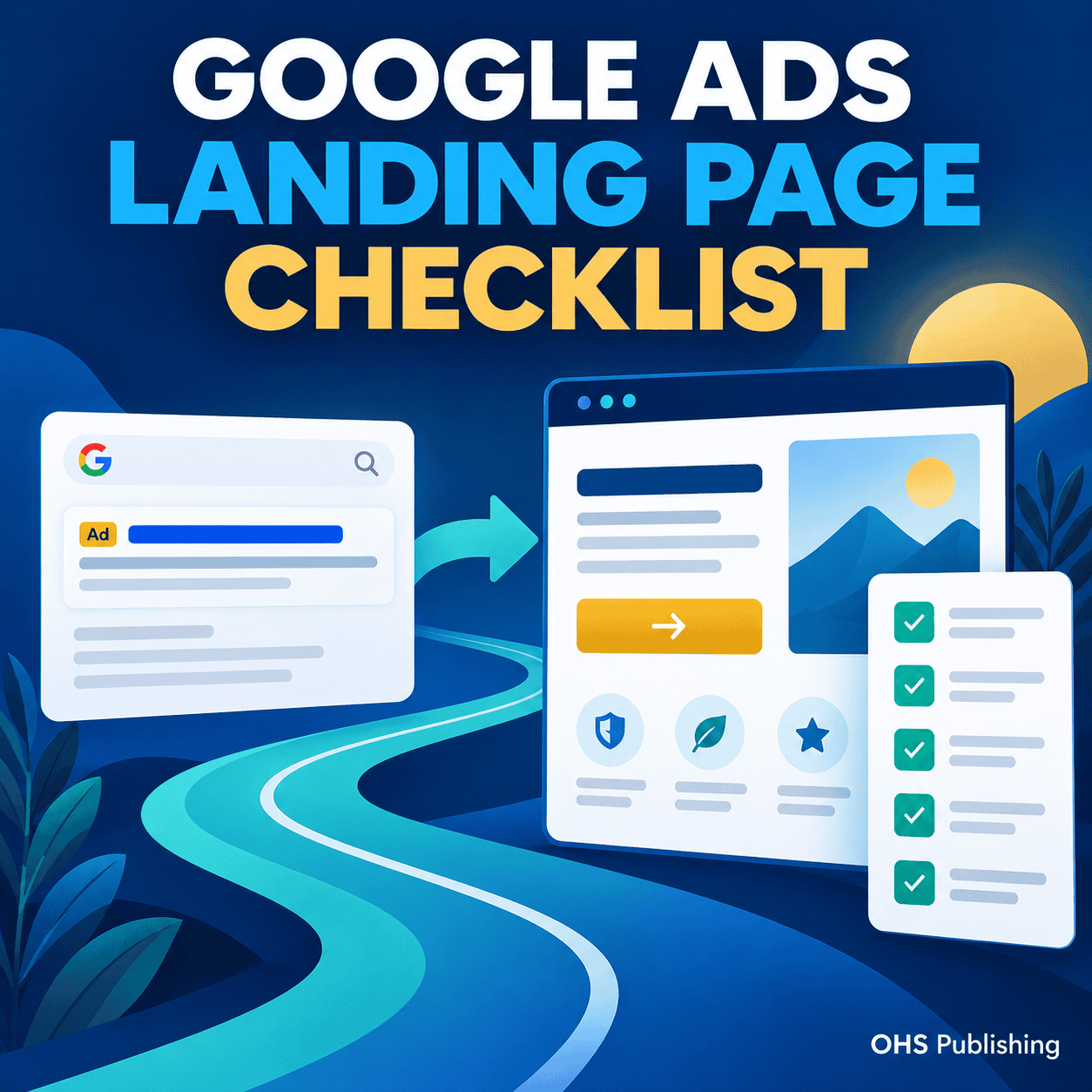
A Google Ads campaign can bring the right person to your website and still fail to produce a useful lead. The click may be relevant. The searcher may be inside your service area. The ad may describe exactly what the person needs. Then the landing page makes the visitor work too hard to confirm the offer, trust the business, or figure out what to do next.
When that happens, increasing the budget usually sends more people into the same weak experience. Before spending more, review the page receiving the traffic. A focused landing page should continue the conversation started by the ad, answer the questions that affect the decision, and make one meaningful next step easy to complete.
This checklist is written for business owners running search ads to generate calls, quote requests, appointments, or other qualified inquiries. It will help you review the page without treating every design preference as a conversion problem.
The Landing Page Is Part of the Campaign
The campaign does not end when someone clicks the ad. The keyword, search, ad message, landing page, contact action, confirmation, and follow-up all belong to the same path.
Google includes landing page experience as one component of its Quality Score diagnostic. According to Google Ads guidance on Quality Score, landing page experience considers how relevant and useful the page is to people who click the ad. Quality Score is not a business KPI or a promise of campaign success, but the guidance reinforces an important point: the destination matters.
A campaign can have sensible targeting and still underperform when the destination is a general homepage, an outdated service page, or a form with no supporting explanation. OHS Publishing's pay-per-click campaign service connects keyword intent, ad messaging, and the landing experience instead of treating them as separate projects.
1. Give Each Page One Primary Conversion Goal
Decide what the visitor should do before revising the design or copy. The primary conversion might be a phone call, estimate request, consultation form, appointment booking, product purchase, or visit to a physical location.
A page can provide more than one contact method, but those methods should support the same goal. A home service landing page might offer both “Call Now” and “Request an Estimate.” That is still one general outcome: starting a service inquiry. Problems begin when the page gives equal emphasis to a newsletter, social profiles, careers, unrelated services, a long blog menu, and the actual request form.
Write the primary goal at the top of your review notes. Then check every section against it. If an element does not help the right visitor understand the offer, trust the business, or take the next step, it may not belong on the page.
2. Match the Page to the Search and Ad
The landing page should feel like the expected next step, not a change of subject. Repeat the core service or offer in natural language near the top. Keep the geographic scope consistent when location matters. If the ad promises a particular consultation, estimate, product category, or response option, the page should explain that same promise.
Imagine someone searches for emergency roof repair, sees an ad about storm-damage roof repairs, and lands on a homepage that opens with “Complete Exterior Solutions.” The visitor now has to determine whether emergency repairs are available, whether the company serves the area, and where to request help. The ad earned the click, but the page did not continue the message.
Alignment does not mean repeating the keyword in every heading. It means keeping the visitor's need, the offer, and the next step consistent from the search through the page.
Separate materially different search intentions
Do not force every campaign into one broad destination. Someone researching a full replacement may need different information from someone seeking a repair. A commercial buyer may care about different qualifications and processes than a homeowner. A branded searcher who already knows the company is different from a new prospect comparing providers.
Separate pages are useful when the offer, decision criteria, proof, or conversion action changes. They are unnecessary when only a few words differ and the visitor's real need is the same.
3. Make the Opening Answer the First Three Questions
The top of the page should quickly tell the right visitor:
- What service, product, or offer is available?
- Who is it for or where is it available?
- What should the visitor do next?
A decorative headline such as “Experience the Difference” answers none of those questions. A clearer opening might say, “Commercial HVAC Repair for Kansas City-Area Facilities” followed by a short explanation and a “Request Service” button. The exact wording will change by business, but clarity should come before cleverness.
The first call to action should be visible without requiring the visitor to understand the entire company history. It should also use wording that accurately describes the next step. “Get Started” can be vague. “Request an Estimate,” “Schedule a Consultation,” or “Call for Availability” sets a clearer expectation.
4. Answer the Questions That Block an Inquiry
A short page is not automatically a focused page. If it removes the information a serious buyer needs, it may create hesitation rather than speed.
Choose content based on the decision. A local service page may need to explain the problems handled, service area, scheduling process, qualifications, and what happens after the request. A professional service may need to clarify who the engagement is for, what the first conversation covers, and what the service does not include. An e-commerce page may need product details, delivery expectations, returns, compatibility, or sizing.
Use headings that let a visitor scan for those answers. Avoid making the page read like an advertisement from top to bottom. Useful information builds confidence because it helps the visitor make a real decision.
For home service campaigns, the OHS guide to building a useful home service website shows how service information, proof, location coverage, and contact paths can work together.
5. Put Trust Near the Point of Decision
Visitors arriving through an ad may have little or no familiarity with the company. They need enough credible information to feel comfortable calling, submitting details, booking, or buying.
Useful proof depends on the business. It may include real reviews, relevant project photos, team information, years in operation, licenses that apply to the work, professional memberships, warranties actually offered, case examples, a clear process, or recognizable client work. Use only information the business can support.
Place proof where it answers a concern. A short review about communication can sit near the inquiry section. A license or insurance statement can appear where a homeowner is evaluating risk. A completed project can support the service it demonstrates. Do not hide every trust signal on an About page and expect paid visitors to go looking for it.
Avoid vague badges, fake counters, anonymous testimonials, and stock photos presented as completed work. They can make a page look busy without making the business more believable.
6. Reduce Friction in the Call, Form, or Booking Path
The page can persuade a visitor and still lose the inquiry at the last step. Test the actual action, not just the appearance of the button.
For phone calls
Make the number easy to find and tap on a mobile device. Check that the link calls the correct number. State the hours when live response is limited, and explain what the caller should do after hours if that matters.
For forms
Ask for information needed to respond or qualify the request. Every extra field should have a purpose. A first-contact form rarely needs the visitor to create an account or supply a complete project specification.
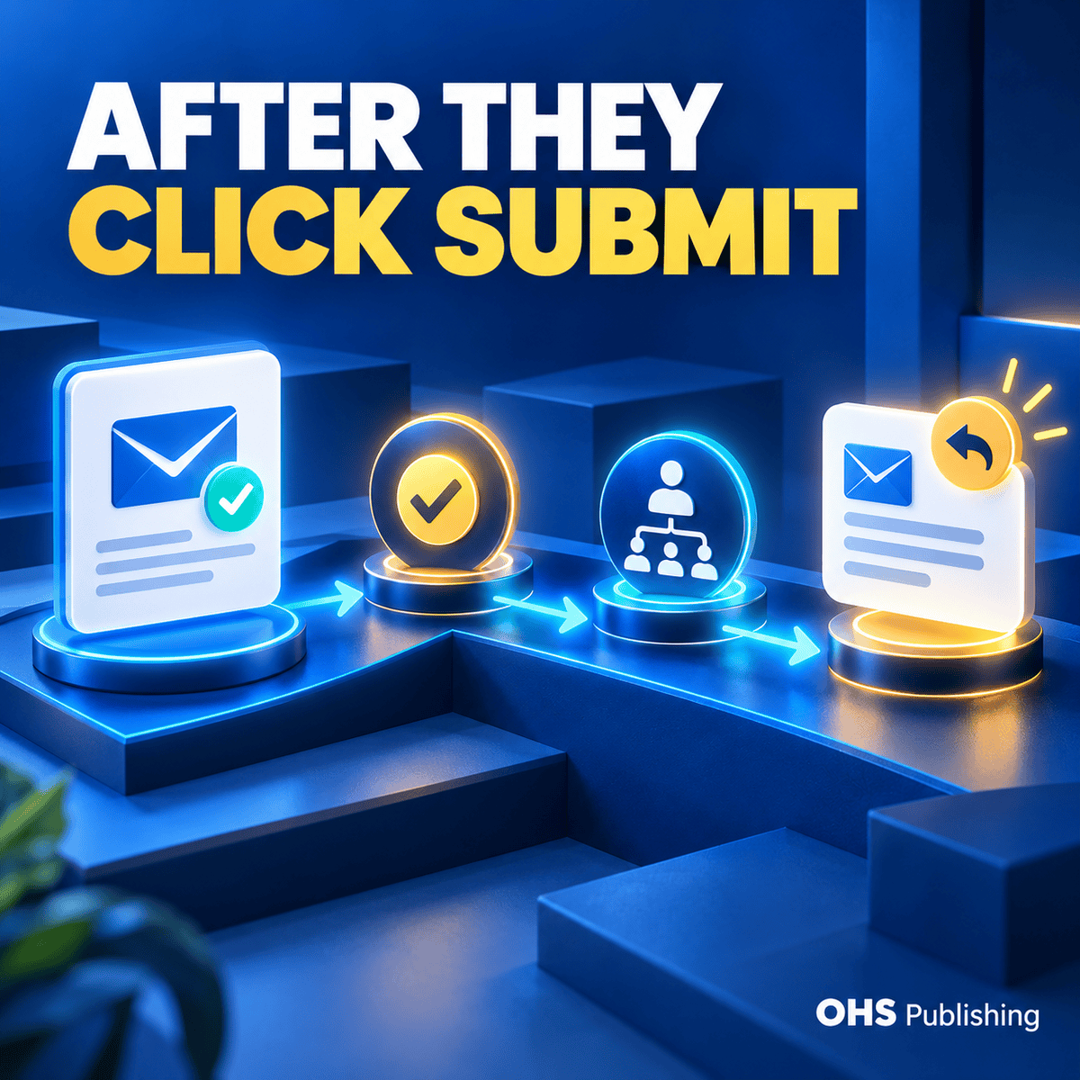
Use understandable labels, helpful error messages, and a clear submit button. After submission, show confirmation that the request was received and explain what happens next. Send the notification to a monitored address and verify that replies are directed to the prospect when appropriate.
For bookings or purchases
Confirm that availability, pricing, required information, payment steps, and cancellation or return information are presented at the right point. Test the complete process on a phone. A third-party booking or checkout tool should feel like a logical continuation of the page, even when the visual design changes.
7. Review the Page on a Real Phone
Paid traffic can reach a page from many screen sizes and connection conditions. A layout that simply shrinks to fit is not enough.
Open the ad destination on a phone and complete the main action. Check whether the headline wraps cleanly, the opening remains understandable, buttons are comfortable to tap, the phone number works, the form is manageable with the on-screen keyboard, and important content is not blocked by a popup or sticky bar.
Watch image cropping closely. The focal point of a desktop hero can disappear on a narrow screen. Also check that proof, pricing explanations, and service-area details do not become difficult to find because the mobile page stacks sections in an unexpected order.
OHS web design services include mobile-friendly page planning, clear service information, and lead-focused contact paths for businesses that need more than a campaign adjustment.
8. Remove Speed and Stability Problems You Can See
Visitors should not have to wait through an oversized background video, watch the page jump while fonts and banners load, or dismiss several overlays before reading the offer. These problems are especially damaging when the visitor clicked because the need was immediate.
Compress unnecessarily large images, remove scripts that do not support the page, avoid autoplay media that delays the main content, and check whether tracking tags or third-party widgets create errors. Use performance tools to investigate technical problems, but also load the page yourself on a normal cellular connection. The practical experience matters more than chasing a score without understanding what causes it.
9. Confirm Conversion Tracking Before Judging Results
A campaign cannot be evaluated accurately if the business is counting the wrong action or missing real leads.
Define which actions count as primary conversions. A completed quote form, qualified phone call, confirmed booking, or purchase may be primary. A page view, button click, or brief visit can be useful diagnostic information without being treated as a lead.
Test each tracked action yourself. Submit the form and confirm the success event occurs once. Click the phone number and understand what is being measured. Complete a booking or test purchase when possible. Make sure a thank-you page cannot be counted repeatedly simply by reloading it.
Tracking should support business decisions. It should help distinguish a targeting problem from a landing-page problem and a follow-up problem. If the website has traffic but inquiries remain unclear, the OHS article on diagnosing website traffic that is not producing leads provides a broader review of the full conversion path.
10. Test the Entire Lead Path and Follow-Up
Submit the page as a prospect would, then follow the lead into the business. Did the notification arrive? Was the phone answered with the correct business name? Did the form include enough context to respond? Did an automated reply set an accurate expectation? Was the lead recorded in the right system?
A strong page cannot compensate for leads sitting unnoticed in a spam folder or customer relationship system. It also cannot fix a slow or confusing follow-up process. The customer experiences the ad, page, contact action, and response as one interaction.
Should You Use a Dedicated Landing Page or an Existing Service Page?
An existing service page can work when it closely matches the campaign, contains the necessary proof and answers, loads well, and provides a clear conversion path. Reusing a strong page also keeps important information in one place and may simplify maintenance.
A dedicated landing page is useful when the campaign has a distinct offer, audience, location, or next step. It can reduce navigation distractions, focus the message, and make testing easier. It should not become a thin duplicate created only to swap a city name or keyword.
Choose the page based on the visitor's decision, not a rigid rule that every ad needs a special page. WordPress can support both durable service pages and campaign-specific destinations. OHS provides WordPress web design for businesses that need flexible, manageable page structures.
How to Prioritize Landing Page Fixes
Do not start by changing button colors. Begin with the problems most likely to interrupt the visitor's decision.
- First, fix broken actions: forms that do not submit, wrong phone links, missing notifications, failed bookings, or incorrect tracking.
- Next, fix message mismatch: make the service, location, offer, and next step consistent with the ad.
- Then, fix missing decision content: add the proof, process, service details, or expectations a qualified prospect needs.
- After that, reduce friction: simplify forms, improve mobile use, remove interruptions, and make the primary action easier to complete.
- Finally, test refinements: compare meaningful changes to headlines, offers, proof placement, or form structure after the foundation works.
Review campaign data by search term, ad group, device, location, landing page, and real lead quality. A page change cannot correct irrelevant searches or out-of-area traffic. Likewise, keyword changes cannot repair a broken form. Diagnose the part of the path that is actually failing.
If you want an outside review of the public website before making changes, use the free OHS Website and SEO Audit to identify visible issues with clarity, service pages, trust, local targeting, and lead paths.
Frequently Asked Questions
Can I send Google Ads traffic to my homepage?
Yes, when the homepage directly matches the search, clearly explains the advertised service, and provides the right next step. A homepage is usually a weaker destination when it covers many unrelated services or makes the visitor search for the offer mentioned in the ad.
How long should a Google Ads landing page be?
It should be long enough to answer the questions that affect the conversion and no longer than necessary. A simple, familiar service may need less explanation than an expensive or complex decision. Judge the page by clarity, usefulness, and completion of the next step rather than a fixed word count.
Should a landing page remove the main website navigation?
Sometimes. Removing or simplifying navigation can keep a campaign-specific page focused, but visitors may still need access to company information, policies, or supporting proof. Use the structure that helps the visitor decide with confidence instead of applying the same rule to every campaign.
What should I test first on a landing page?
Test that the phone, form, booking, purchase, confirmation, notification, and conversion tracking all work. After the path is reliable, review the match between the search, ad, opening message, offer, and call to action before testing smaller visual changes.
Does a better landing page guarantee more leads?
No. Lead results also depend on search intent, targeting, competition, offer, pricing, reputation, budget, tracking, and follow-up. A stronger landing page removes avoidable friction and gives qualified visitors a clearer path, but it cannot guarantee traffic volume or lead outcomes.
Make the Click Lead Somewhere Useful
A paid click is an opportunity, not a result. The landing page has to confirm that the visitor reached the right place, explain enough to support the decision, and make contact easy. When those basics are missing, adding budget can magnify the waste.
OHS Publishing can review the connection between your ads, website pages, and lead path. If your campaign is bringing traffic without enough qualified inquiries, request a review before increasing spend. We can help identify whether the next priority is campaign targeting, landing-page content, website design, tracking, or a combination of those areas.